As 2025 approaches, our interior decor is poised to undergo a subtle revolution through color harmony. As trends evolve over time, four key shades are emerging, promising to transform spaces into warm, contemporary sanctuaries. Ranging from bold shades to soothing tones, these colors are the must-haves for the coming year, shaping the atmosphere of homes with elegance and modernity.
Discover how the choices of renowned brands such as Tollens, Dulux Valentine, Farrow & Ball, and Benjamin Moore align with these trends to offer a palette as vast as it is refined. An invitation to refresh your interior with carefully selected shades, for a home that resonates with 2025.
The 4 must-have shades that will transcend interior design in 2025
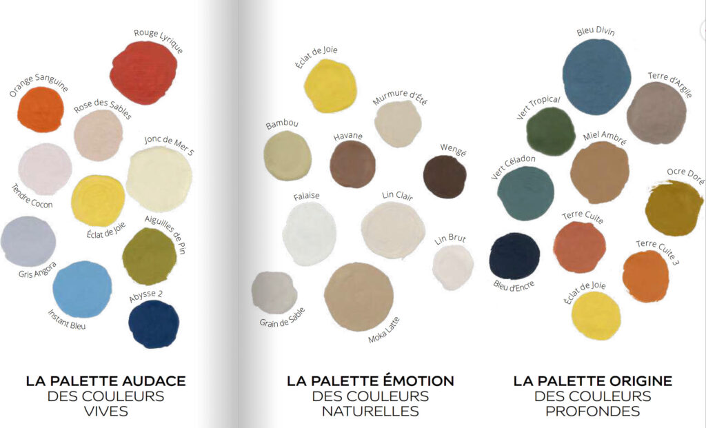
Let’s dive into what will grace the walls and objects of our homes this year. The first choice gravitates toward earthy shades, such as ochres and terracottas, lending a natural and reassuring feel to living spaces. These colors are highlighted by manufacturers such as Luxens and V33, whose collections reveal a palette that invites serenity.
Next, deep blue is reinvented, oscillating from navy to cobalt, offering an enveloping depth ideal for dressing a living room or bedroom. Farrow & Ball and Little Greene thus offer iconic references that are establishing themselves in the trends thanks to their intensity and versatility.
The third choice is surprising in its originality: soft, luminous greens, celebrating nature and providing a green interlude, rooted in the Sikkens and Ripolin collections, which rely on beloved fresh shades to create a soothing atmosphere. Finally, the last chromatic refuge reconnects with the softness of pastels, notably powder pink and delicate apricot, designed by Dulux Valentine and Ressource Peintures. These shades bring lightness and warmth, perfect for personalizing a bedroom or entryway.

Why do these shades embody a new era for our homes?
Beyond their aesthetics, these colors embody a deep need for harmony with our environment. In 2025, the quest for well-being within the home guides the choice of shades, where serenity and connection with nature prevail. These choices reflect a cultural and ecological context where decorating is part of a sustainable and soothing approach.
Brands like Benjamin Moore and Tollens are developing paints with a low environmental impact, supporting responsible decorating. The dialogue between these natural shades and eco-responsibility transcends mere trends to embody a true art of living.
How can you incorporate these key colors into your decorating project?
Adapting these shades to your interior requires a thoughtful balance between boldness and subtlety. For example, Luxens and V33 recommend using earth tones as accent walls, combining authenticity and warmth without saturating the space. To energize a room, deep blues are perfect for furniture or decorative elements, bringing elegance and character, according to Farrow & Ball’s recommendations.
For more refined environments, soft greens from Sikkens or Ripolin breathe a natural touch into accessories and textiles, perfect for refreshing an ambiance without overturning everything. As for pastels from Dulux Valentine or Ressource Peintures, they delicately illuminate frames and ceilings, giving the room an aura of softness and well-being.
Experiences and testimonials from design enthusiasts
Martine, an interior designer in Lyon, shares how choosing these colors has transformed her recent projects, notably by combining a deep terracotta applied by Benjamin Moore in a living room with touches of pink pastels for the bedroom. This subtle contrast brings balance and freshness.
Meanwhile, a design studio in Paris uses the bright greens of Little Greene to create inspiring workspaces, promoting concentration and creativity. These concrete experiences illustrate the transformative power of these palettes, in line with trends observed at events such as Feria Habitat Valencia Design.
Ne manquez rien !
Recevez les dernieres actualites business, finance et lifestyle directement dans votre boite mail.